MASS TABLE
BONALDO
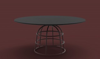
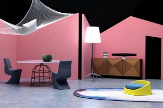
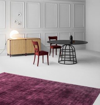
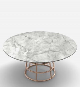
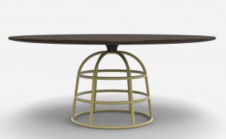
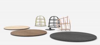
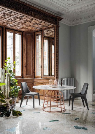
The “Mass” table collection is a discussion between the visual presence and the actual mass of a product and its different components. It plays on a well-known archetype: the dining table, the stability of which is ensured by a large solid base.
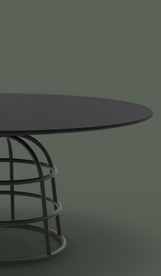
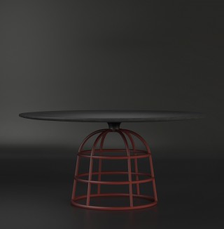
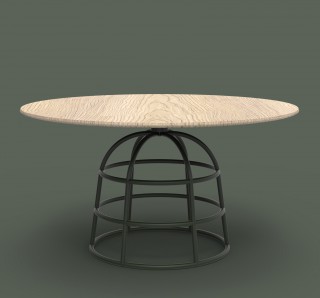
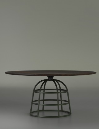
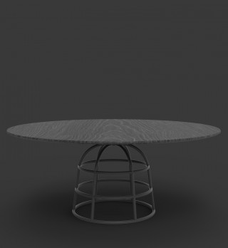
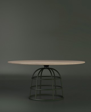
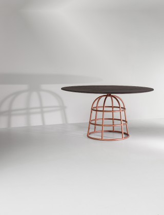
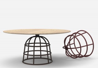
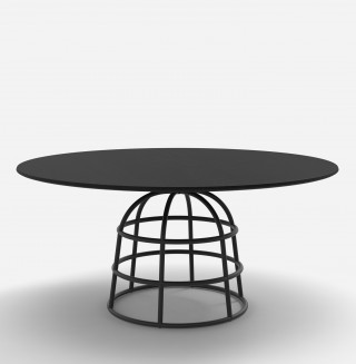
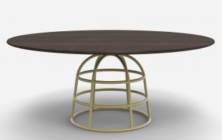
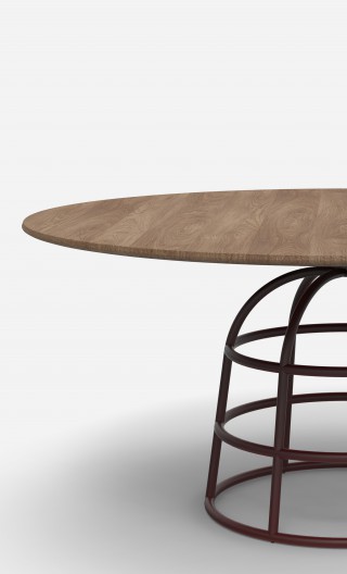
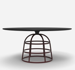
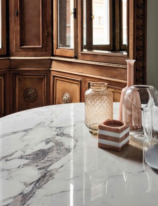
In the case of the Mass table, the base has become a lightweight see-through element while, by comparison, the wooden tabletop has become a plain visual mass. In this way, the weight and visual weight of the elements have been inverted in comparison to the archetype. This is further emphasized by the visual gap created between the base and the tabletop thanks to a connecting element.
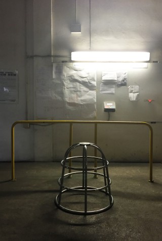
The architecture of the base is very similar to a “crinoline”, the underskirt invented and used by women in high society in around 1830. But this architecture is also very modern and resembles the “wireframe” structure of a 3D CAD model used by architects and designers. These wireframes are what we, designers see when sculpting a design in 3D on the computer. So, in a way, the base is a subtle mix of tradition and modernity.
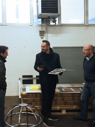
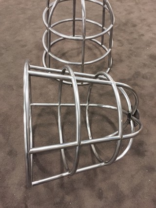
The production of the metal base relies on the precision of the computer-controlled tools (the CNC machines) to correctly bend and cut each tubular part composing the whole and the expertise and ability of the welder who perfectly assembles and finishes them.
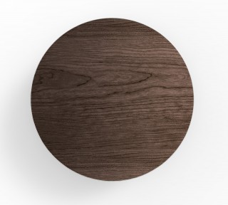
As for the wooden tabletop, although it is more solid than in general, it looks like it is floating and resting on one single point right above the connecting element between the tabletop and the base.
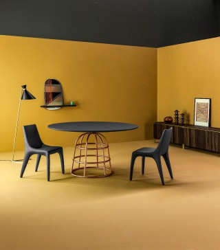
The end result is a graphic table that has a strong personality but doesn’t take up too much room visually. It is also a table that generates a visual tension and movement as one moves away from or around the table.
