STACKED-UP
YO2 RUGS
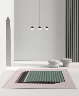
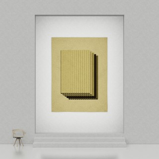
The collection highlights what could almost be seen as a piece of industrial memorabilia. It gives importance to what most people would not pay attention to or would not see as interesting, and converts it into a graphic element that transcends the value of the object highlighted. The collection plays in almost an ironic manner with this layering and three-dimensional design scheme that has now become relatively common in a lot of rug designs.
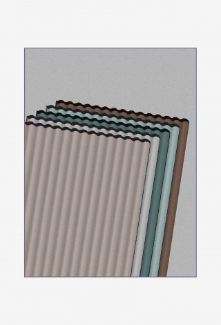
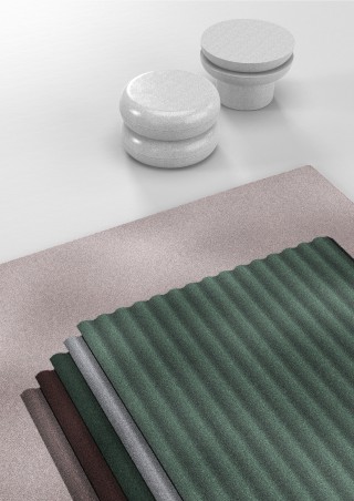
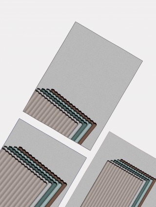
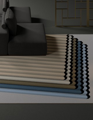
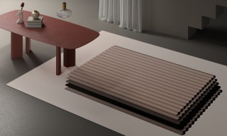
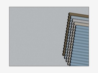
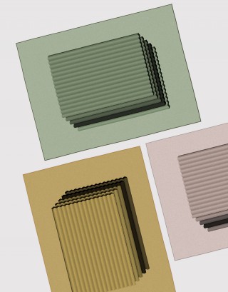
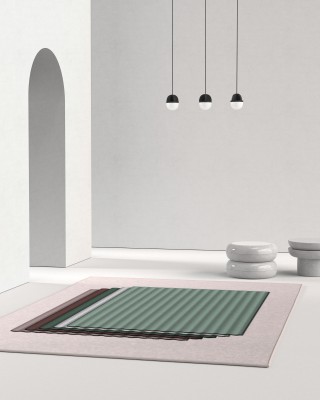
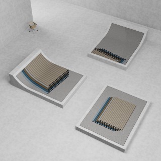
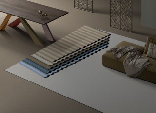
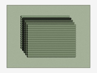
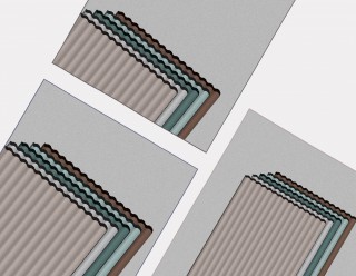
The Stacked-Up collection is all about effecting a three-dimensional visual experience and optical illusion. The design gives the impression that the stack of corrugated metal sheets featured at the center of the rug is real, that it has a real depth. This three-dimensional effect will vary depending on the angle from which it is viewed. The shadows created by the stacked-up pieces become a very important graphic element of the rug and even come center stage on the version in which the composition is off-centered.
The irony of the design of the rugs lies in the fact that what is represented are elements of very poor value, nothing more really than a stack of construction material. But the subtlety of its curves, its colors, and its overall graphic treatment turn them into subtle graphic pieces that, depending on the version, will either be more figurative, or purely graphic.
